If you’ve been a designer for some time, or happen to see how designers work chances are you might have witnessed them using circles or rectangles to form their logo designs. They are not using them randomly, in fact, they are using one of the most ancient formulas that make any design look harmonic and pleasing to the eye – The Golden Ratio.
Today, we are going to dive into using the Golden Ratio in logo design, what is the Fibonacci sequence, and why you as a designer should not shy away from using it.
Is the beauty in the eye of the beholder?
Before we dive into the technicalities, let’s set the question straight – is beauty subjective? At Gingersauce, we believe it’s not.
If it was – why would anyone learn design, its principles, color theory, or proportions? In that case, Design would not be considered a profession.
The fact holds: everything around us is subject to one formula – the Fibonacci sequence (click here to get to the explaining part of the article). Nature, space, flowers, seashells, everything. Because subconsciously we are so used to seeing it, everything that is in fact built using the proportion is perceived as the most beautiful, harmonic, and pleasing to the eye.
There is a reason artists, sculptors, and architects have been using the formula for centuries already to create their masterpieces.
What about logo design?
Well, it is no exception. Here’s how using the Golden ratio in logo design can be beneficial for you:
- The golden ratio can become your design grid, a framework for the right decisions.
- Since things built around the golden ratio are considered more beautiful, the logos you provide to your clients may become more valuable.
- Built according to the principles of nature, such logos are a lot more memorable than their more chaotic counterparts.
- The human brain enjoys views, sounds, situations it can predict. If built according to the Golden ratio, the logo becomes more harmonic.
So, what is the golden ratio?
The ratio is the relationship between 2 or more elements. The Golden ratio will form if the proportion is 1:1.618.
How did we get the number 1.618?
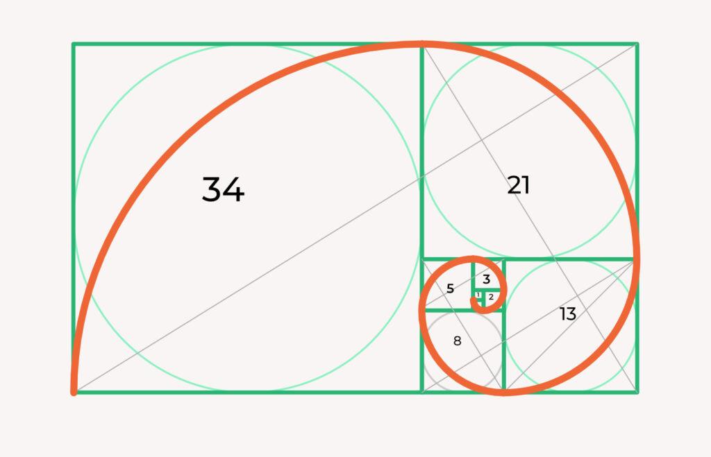
The number takes its roots from the Fibonacci sequence: 0,1,1,3,5,8,13,21,34 .. The next number is a combination of the previous two.
The sequence itself can be found all over nature, in the number of flower petals, spirals of a sunflower, or a pineapple. This sequence is the mathematical rule our world is built on.
What does it have to do with the golden ratio?
The ratio of two consecutive numbers from the sequence gets closer and closer to the Golden Ratio, 1.618 the further we go.
In its essence, the golden ratio is the relationship between two quantities where the ratio of the small quantity (a) to the large quantity (b) is the same as the ratio of the large (b) to the whole (a+b).
Here’s when it gets interesting. Bear with us.
If we were to visualize Fibonacci’s sequence, here’s what it would look like:

The progression of numbers form a visual pattern:


Notice the proportion of the formed rectangle’s sides: 1:1,618 – exactly the Golden ratio.
If we go further, by connecting the angles you can form a Golden Spiral.
Using the Golden Ratio in logo design
We understand that you might be at a loss, and confused after all those numbers. Don’t worry, this part is a lot more interesting. As soon as you understand what is the Golden spiral and how it occurs to everyone you step your foot, you can start using it in your logo design.
This is how.
Golden ratio in logo design: Use Shapes
The golden rectangle will become your best friend. Its parts can be used as a grid to form the foundation for your logo design.
For example, try inscribing the circles into each of the internal squares. A series of circles you receive can be used to create more round logos, like Twitter or Apple ones.

If your logo calls for something with sharp angles, you can also take the squares or rectangles.

Combine the shapes to create different logo elements.
Tip: Do not scale the shapes, otherwise the proportions will be lost.
Golden ratio in logo design: Use Proportions
Another way you can use the Golden Ratio is to determine the height and width of the logo as well as the proportions of the internal elements to the whole logo.

Did you know that Gingersauce calculates the proportions of your logo automatically?
Upon uploading a logo, you can choose between models that take different values as a control point.

The 1:5 ratio that Gingersauce’s logo is built according to is also found on the Fibonacci’s sequence. Just like 1:1, 1:2, 1:3, 2:3, it has value in the branding process, demonstrating the calculations made in the design process.
Why do you need that?
If you present your logo design using brand books (which we highly recommend), you can use the feature to:
- Show the client that your logo is not simply a picture, there is a thought behind it, a structure that will make the design more appealing and memorable.
- Use the calculations for further use. Proportions automatically calculated and presented in a brand book can serve as a guide for the brand’s future family designs, like Icons for example.
Golden ratio in logo design: Use Placement
The Golden rectangle is often used to place the objects, and define what composition is the best. Using the rectangle grid (or a few of them) you can inscribe the elements into it. This is how you make sure all of the parts of your logo are placed harmonically and don’t ‘offend the eye’ of the beholder.

What about 2:3?
Currently, in a lot of design studies you can see people talking about the 2:3 ratio. It’s especially often met in composition tutorials. The 2:3 is not another alternative to using the Golden ratio. It’s just a simplification of the 1:1.618 equation, made to help with the understanding.
Our brains comprehend round numbers a lot better.
The Bottom Line
At this point, it won’t be strange of you to think ‘Is it necessary? What if I don’t use Golden Ratio in logo design? Will my designs look bad if I don’t stick to the rule’?
No, they won’t. After all, it is not carved in stone that you have to use the Golden ratio in logo design. Using it, however, is a way for you to bring more thought into the logo, making it more memorable. It is another way for you to offer more value to the client.
Some of the designers also find the grid helpful, including us. Using it as a guide you can bring life into nearly any idea out there, and being technical and harmonical about it.
Created A Logo Using Golden Ratio? Present it with Gingersauce!
Gingersauce is a professional tool for creating brand guidelines, that combines smart automation and your creativity. Upload a logo, get your proportions calculated, and build a brand identity for your client: all this in a few quick steps. Presenting with Gingersauce is professional and saves valuable time.
You can download a created brand book right away – it will only take a few minutes to do so!