According to this report, 6 in 10 consumer purchases are influenced by the “power” of a business’s brand.
We cannot stress enough how important Branding is in today’s world: when each user can choose from a myriad of options.
Brand design is of primary significance in the overall branding saga – that is the process of identification of a company in the eyes of the consumers. It is the creation of the logo, graphics, shapes, colors, and other elements, that play a crucial role in creating a distinctive identity that stands out from the other brands.
It is understandably hard sometimes to get lost in color palette choices, interesting shapes and so many options on the plate: this is where brand design principles have your back. And it’s better to adhere to them from the very infancy of the startup.
What are the brand design principles and what to use them for?
Brand design principles are a list of factors that define the basic guidelines of a good design or a product. They will help you, as a designer, to not get carried away and create the most effective design in terms of setting a certain impression on consumers. You, as a brand, will find them useful with decision making and aligning all team members with what’s true to the brand.
10 Commandments of the Good Design

1970 were a whole lot – a cacophony of colors, patterns, lifestyles. This chaos didn’t spare the design field, and had the designers of that time at a complete loss. Becoming increasingly concerned with the surrounding world – “an impenetrable confusion of forms, colours and noises” – Dieter Rams, a German industrial designer, has created his famous ten brand design hierarchy of principles. Also known as 10 commandments of good design.
Here they are:
- Good design is innovative
- Good design makes a product/service useful
- Good design is aesthetically pleasing
- Good design makes a product understandable
- Good design is unobtrusive
- Good design is honest
- Good design is long-lasting
- Good design is thorough down to the last detail
- Good design is environmentally-friendly
- Good design is as little design as possible
Initially created for the industrial design, the listed principles still hold true to web design, UI/UX design, and basically any visuals you’re working on.
Gingersauce’s Top 10 Design Principles
Behind the Gingersauce tool for creating brand books, there stands a team of designers with years of experience. Naturally, we have collected so many cool tips, and tricks, and advice we cannot wait to share – the core reason why this blog exists.
Today we’re listing the 10 design principles we believe work best when creating your brand identity. Let’s go 🙂
1. Visuals Reflect The Brand
Every brand has a character, a specific ‘feel’ to it, expressed in its mission and vision statements, a sphere of work, services it provides. These attributes should always echo in all the visuals you create.
For example, if you’re designing a logo for a serious institution, like a law firm, or some medical clinic, you should naturally avoid overly vivid colors, and funky fonts. A logo for a lovely bookstore calls for some pastelle cozy colors, and cursive fonts.
☝? Tip: before starting working on any visuals, try creating a brand personality map.

2. Avoid Being Repetitive
When building a brand identity we try our hardest to stand out, to make sure the brand is not mixed with another one. Sometimes, companies do not follow these principles and intentionally copy designs of their competitors, in order to win over some of their customers.
We must say, this is not a good idea. Though a brand might get a client or two – driving on that similarity feelings, they might also find themselves in a ceaseless rain of lawsuits. It’s never good for the reputation either.
Our advice is to find such a style of visuals that will become strongly associated with a specific brand. Like a certain shade of red Coca cola uses, or a blue birdie that will always remain in our minds as a Twitter mascot.

3. Less is More
The golden rule – do not overcomplicate your visuals! One thing you don’t need is to confuse people, and overbury them with too many elements. The simpler – the easier it is to remember. If you take a look at the best known brands, they always go with something light – minimum of colors, shapes and elements.
If you’re not sure if your logo, for instance, is simple enough, ask yourself a question “Will a user be able to draw the logo, after seeing it once or twice?”. If not, you know what to do.

4. Holy Trinity of Colors
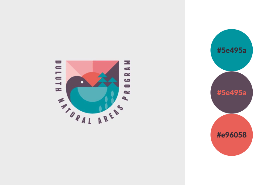
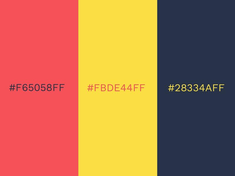
Minimalistic approach should be applied to every aspect – including the colors. One of the main design rules is to use a maximum of three colors. This doesn’t only have to do with the possible sensory overload, but also has a financial reason for it. You will need to pay more for additional colors, when printing any materials.

5. A Psyche Behind Your Palettes
Every color has its own association, an emotion it evokes in a person. It is crucial to consider what impact your color scheme will have on your customer. Bright contrasting colors grab the attention, while light, monochromatic ones set a peaceful mood.

6. Blank Space
If you want to emphasize some parts of your design, and make sure they are efficiently highlighted in the real use-cases, blank space is your friend. Leave some nothingness around the edges to see the colors pop even more.

7. Evoke Emotions
A design that doesn’t resonate with people can’t be called a good design. While thinking about the brand design, the main thing for you to focus on is evoking emotions. After all, if after seeing your visuals people feel something, they will remember your brand for a long time.

8. Stand Out Visually
People scroll through their feeds at a lightning speed nowadays – the attention span has never been this short. That is why your brand design should catch the eye to make people stop scrolling and pay attention.

☝? Tip: If you are not sure if your design stands out enough, you may want to try the scroll test. Put it somewhere to your dashboard, and see if it blends into all the other posts. If yes is the answer, then think about changing the design a bit.
9. Keep Everything Cohesive
All elements of your visual branding design should tell the same story. Consider this, every puzzle piece is different, yet they form a united, cohesive picture.
By setting the tone of your brand, picking a single color palette, agreeing on the overall shapes, and what is more important – adhering to these guidelines, you help the brand customers to feel like everything is entwined together.

10. Create Brand Guidelines
To ensure the cohesiveness of the brand we talked about in the previous paragraph, it is a good idea to establish brand guidelines, by the creation of a brand book.
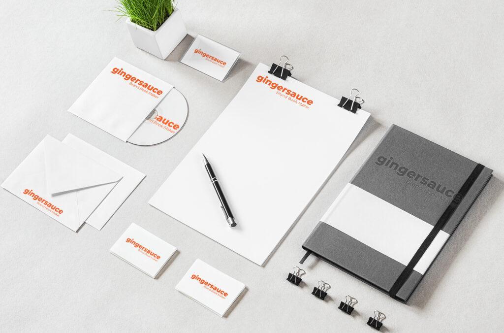
If you want the brand to work, you need to make sure you set the rules on how your visuals work, and what manipulations are allowed. If you are a brand owner, having a brand book is a must, as it allows your designers, or employees on the outsource, to keep aligned with the tone of your brand.
How Gingersauce helps with your brand design?
Gingersauce is a professional tool for creating brand guidelines, that combines smart automation and your creativity. It’s a professional tool – meaning, it won’t do a half-baked job, leaving you with a mediocre result. Gingersauce will gather all your visuals in one place and will help you make sure your brand design stays consistent and cohesive.
You can download a created brand book right away – it will look promising even with no customization!
Were our brand design principles helpful? Share, quote, and let us know what you think!


