In 2020, companies and designers take all kinds of approaches to delivering brand book best layouts and content. We asked our community about examples that they refer to when thinking of a professional brand guideline. This is how we made a list of examples- by big companies and smaller businesses. Let’s take a look at our top choices, made by professional designers and analyze what makes these choices so good.
Brand book Best examples from brands
We analyzed the best branding guidelines from famous brands. The choice criteria were design quality, writing style, composition, brand book elements and structure.
The top choice was on brands that included all the necessary information and made their identity clear even to non-designers.
Slack Guidelines

Slack is a primary example of a design-driven approach. The Slack brand book has all the necessary elements, going in-depth about mission and vision, tone of voice, company colors, logo use cases.
The main reasons why designers (us included) think Slack has one of the best brand books in the business:
- Coherent design: the structure and style of the brand book reflects the business’ personality well;
- It’s easy to read: guidelines aren’t overloaded with unnecessary specifications, which makes it easy to understand even for non-designers;
- A lot of space: the pages of the book are clearly structured, which places emphasis on visuals;
- An engaging writing style: Slack’s branding is proof that guidelines don’t have to be boring.

For us, Slack’s approach to branding and guidelines is one of the most essential references. Slack brand book really is the definition of spicy – and we at Gingersauce, emphasize well with this approach.
Skype Guidelines

Although Skype by no means is a modern guideline, it still sets the tone for how an engaging guideline is done. Although it was done many years ago, the style and message of the Skype guideline is highly relevant.
The main reasons why designers put Skype among brand book best examples:
- Skype brand book describes interface details in a fun way: for a software, it’s important to regiment how its basic features will be displayed. Their way of conveying the acceptable shape of a message box, the messaging interface is exemplary.
- Fun illustrations. Skype is an example of great use of supporting visuals.
- Easy to read. Just like Slack’s brand book, Skype’s guidelines feature a lot of space. Elements vividly stand out on the page.

Skype is an example of a brand book that goes beyond typical logos and fonts. Keep in mind that not every company and product needs such an in-depth approach. For those that do – it’s a great way to relate the nuts and bolts of the design.
Red Cross Guidelines
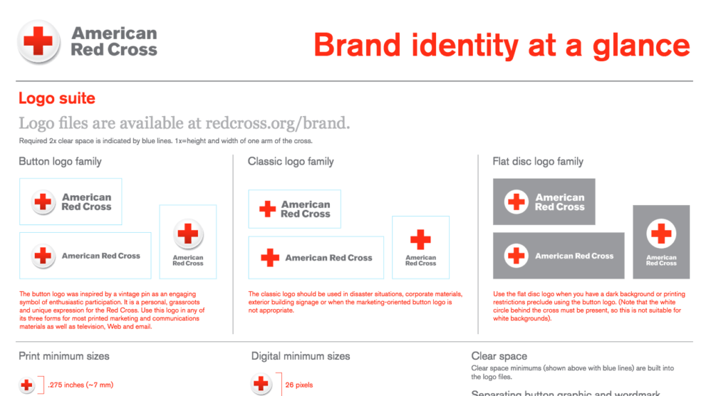
The choice to put Red Cross’ guidelines together with business-oriented guidelines might seem unlikely, at first. However, the approach that the organization took to describe its identity really stands out.

Our community pointed out that even brand book best examples often tend to be unnecessary long – and we agree. At Gingersauce, we prefer guidelines of 20-30 pages – it allows us to mix detailed and concise approaches. Red Cross, however, took it to another level, packing all the elements on a single page.
Advantages of Red Cross’ one-page guidelines:
- Lightweight: such a file is easy to send via any messenger or email and is fast to download;
- No unnecessary details: the guideline doesn’t bore readers with unnecessary details and specifications;
- There’s space for creativity: some guidelines lack flexibility about the use of their identity. Red Cross leaves space for creativity and interpretation.

That said, it’s important to remember that the Red Cross isn’t a business, in its typical meaning. The rules of regimenting an identity in the non-profit world are slightly different. We noticed that many organizations neglect to create a brand book whatsoever – and we are grateful that Red Cross gives a good example. Their guidelines are rightfully placed among examples everyone can refer to when looking for a sample how to describe the design use cases.
Instagram Brand Book Best Examples
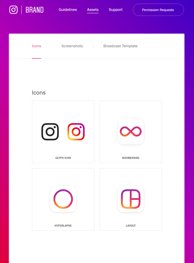
For visually-oriented brands, like Instagram, having a concise identity is everything. If your business deals with design, photography, aesthetics, Instagram is a great reference. The Instagram brand book is published on the web site and organized in separate pages.

This approach is becoming increasingly more popular. However, if you are not a big brand yet, it’s advisable to have a PDF file as well. Paying for hosting and maintenance of a full-fledged website just for branding is unreasonable for most SMBs. Also, as designers, we think that working with portable files is rather common – they can be previewed offline.
The main advantages of Instagram brand book are the following:
- Detailed: the Instagram guidelines describe the use of primary, secondary logos, icons;
- Downloadable: you can download all the assets directly from the Instagram guidelines page;
- Shareable: accessing assets via a link doesn’t require file downloads, all the updates are visible right away.

Web-based storage of branding assets allows company to keep their identity always updated and relevant. This is why we at Gingersauce enable both online and offline sharing as one of brand book best practices. If you want your team and partners to be updated on the changes in real-time, you can share branding assets online. If you’d like to have a readable and portable version, you can download a PDF file.
Conclusion
A good brand book is flexible, easy to written, well-written and composed. Both writing and design elements should represent the brand’s tone of voice, mission and vision, and visual style.
You don’t have to hire a professional design team for these purposes, though. Build an impressive guideline with Gingersauce for free. The templates were designed by professional branding designers. All you need to get started is a logo.
Starbucks Guidelines

Another great example of a web-based brand book is Starbucks. Just like Insta, this famous brand has a widely recognized and emulated identity. It’s crucial for the company to keep assets public and updated to avoid confusion and asset misuse.
However, in our opinion, Starbucks took the design of their web brand book even further. The company hosts a standalone site with pages, dedicated to logos, fonts, assets, illustrations. On top of that, it’s very interactive.
- Users can type anything in Starbucks’ custom font to see how it’s going to look
- Stylish design: the brand book itself follows all the rules of the guideline and serves as a first-hand representation of the identity;
- The Starbucks brand book elaborates on practice and theory: there are separate pages for theoretical rules and another one for case studies with practical applications.

Starbucks built a complex website that gives a full overview of the entire brand identity. The only downside of this approach is that guidelines ended up too extensive. It’ll take you 10-20 minutes to understand the main rules of brand identity usage and browse the main assets.
Google Brand Book
We would say that Google brand guidelines are in the top rankings among our best brand book examples added to this article. It’s amazingly detailed and elaborate, written in a typical professional manner that Google has.
Here’s why we believe that Google has one of the best brand book examples today:
- Crazy elaboration. The brand goes in-depth describing how, when, and in what ways their identity elements should (and shouldn’t be used).
- The Google brand book holds every element the brand needs to be true to, including the principles of their brand photography.
- The professional, yet friendly tone of voice.
Overall, we can say that Google – a big brand that it is – takes their identity incredibly seriously. From the get-go, it sets frames of reference for every element it uses, leaving little room for branding mistakes.
Facebook Brand Guidelines
A Facebook brand book is not a simple one. The company has a lot of projects with different branding. That is why the best decision for them was to create a website and feature all of the guidelines separately. Let’s take a look at the Facebook app brand guidelines.
As we can see, the facebook guidelines are nowhere near cluttered. Their online brand book is very laconic and straight to the point.
Let’s see why this paticular brand book is a good brand book example:
- Simplistic. Nothing steals the show. With such a design all the person’s attention stays on the identity elements and usage rules.
- Marketing oriented. We can see that the company has taken a lot of marketing points into consideration. The brand even states what phrases are better used paired with the Facebook name. What attention to details!
- Downloadable. Their asset pack doesn’t take too much space on the page, all because it is downloadable. Convenient.
Dribble Brand Book
You might say, why do you put Dribbble’s brand guidelines in the top brand books list if it’s only few sections? Well, because, sometimes this is all it takes. The brand doesn’t have a lot of identity to showcase, yet they make everything just right with the ones they do have.
Dribbble guidelines are cool, because…
- Explanatory. When providing the color palette, Dribbble explains well what logo of which color needs to be used in what background color. They also provide the names of the shades and their color codes.
- Not forced. Sometimes brands think that the more leements they have in a brand book, the more professional they look. This is not entirely true. A brand guidelines document should contain the information you have and work with, nothing forced and created for the simple purpose of adding it to the brand book.
- Downloadable. All the logos and icons are available for download in a multitude of formats.
Apple Brand Guidelines
Apple brand book is true to the brand: highly professional and dedicated to details. It’s not a secret that Apple takes branding super seriously, and that is why they did their best to make sure they won’t be represented wrong.
- Informative. Apple brand guidelines are a library of all needed information for every type of partnership. It contains rules of thumb for stationary printing, vehicle branding and even the layout of the reseller store exterior and interior.
- Conservative. With that detailed brand book it’s a win to avoid cluttering it. White background, black text and illustrative materials are everything you need.
- Easy to navigate. The third page of the Apple brand book contains a table of contents. For such a big document it’s a necessity, since people need to quickly get the information they came for.
Snapchat Brand Guidelines
Snapchat brand book is super cute – just as the brand’s identity elements! In their tone of voice they are friendly, in the way they lay out the information they are very clear.
If you’re looking for brand book examples pdf ‘s, stop for a minute to check out the Snapchat brand guidelines, because:
- The brand book is very clear. They do not overcomplicate their wording, they are clear in their expressions, and leave no room for ambiguity.
- Tone of voice. The friendly tone Snapchat uses sets makes you feel close to the brand. You won’t use the friend’s assets wrong, won’t you?
- Not cluttered. Inside the brand book you will find links to separate PDFs with guidelines for different elements. This system allows the brand to a) leave more space untouched; b) link up every material people might need.
Pinterest Brand Guidelines
A lot of information in the Pinterest brand book is dedicated to their most iconic element – color. Pinterest red is now its official name, and is easily recognizable.
Why Pinterest brand guidelines are awesome?
- True to the mission. “To bring everyone the inspiration to create a life they love” is a mission of the brand, and it’s easily visible in every element in the brand book. From the colors, to the brand’s photography.
- Every element you need. Speaks for itself, everything you may need you will find. They don’t keep you looking for too long.
Spotify Brand Guidelines
Spotify brand book is an online based. Providing everything you’ll probably ever need, they are also open to communication and encourage anyone to reach out in case they have questions. Great attitude!
Let’s see why Spotify brand guidelines are one of the best:
- Downloadable elements. Conveniently, on the page, you will find both the pictures and links to download elements like a logo and icon.
- Rules for developers. The page says it’s dedicated to helping others to integrate Spotify into projects and it really helps! Apart from the rules of how to use the identity element, you will also find their integratable widgets.
Guberman Brand Guidelines

By Gingersauce
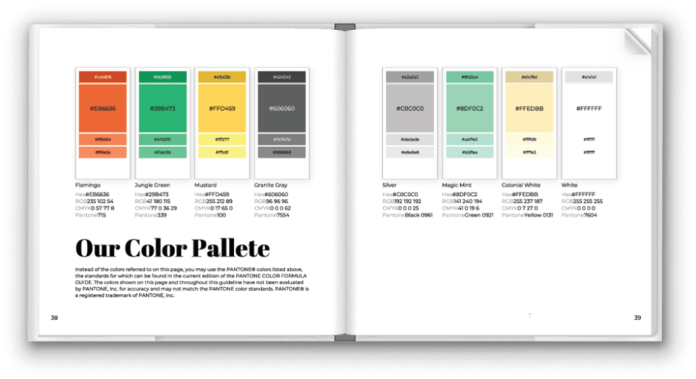
It’s a minimalistic but detailed brand book that focuses on the brand from a precise, almost scientific standpoint. The brand book describes the rules of use of primary, secondary logos, primary, and additional icons. It goes in-depth about fonts, their weight, decorations, which is a very important practical aspect.
What do we like about the brand book?
- It’s easy to read: pages aren’t overloaded with unnecessary details: the name of the chapter of the book is to the left, contents – to the right;
- It reads like a book: the traditional look and feel of a brand book is what many designers fail to factor in. From our experience of talking to enterprises and SMBs, we know that businesses still love flipbooks and PDFs.
- It provides many contexts: designers paid attention to textual and mathematical aspects of a brand identity. During promotion and communication, this will make a huge difference.
A final thought
You’d think creating the brand book layouts, like the ones above should’ve taken hours. It likely did – making a brand identity is a big task for a designer, and even for an agency. Determining a structure, positioning assets, describing every element, assembling visuals – there’s a lot of manual work that goes into making a brand book.
Well, not anymore. It turns out, brand book creation already was made more efficient – by us. We built Gingersauce – a professional tool for creating brand books that offers smart automation to pull up palettes from your logo, create use and misuse cases, and calculate the proportions of your logo. In fact, the last brand book on the list, Guberman, was built using Gingersauce – and not in days, but in minutes. Try out Gingersauce – create the first brand book for free!


