Welcome to part two of our ‘Why your client doesn’t need a logo’ series! Last time we discussed what you as a designer should do if your clients ask you to create a logo for them. We highly recommend you going through that article first: there is some valuable advice that you can use to convince your client to go for a brand identity: both to your and the client’s benefit.
Today we’ll see what are the elements that comprise a good visual brand identity: according to Gingersauce — and answer the following questions:
- What elements of the visual brand identity design you should offer to your client?
- What reasoning can you provide to convince them they definitely need that?
What is brand identity vs visual brand identity?
To recap, brand identity definition goes like this: “the outward expression of a brand, including its trademark, name, communications, and visual appearance,” according to a branding-pro Marty Neumeier.
Without big words, in its essence brand identity is the means a company creates to communicate with its target audience. Using brand identity brands can get the message across and establish a certain image among their users.
That’s settled. But since today we’re trying to find an answer to what you as a designer can offer to your client, we’ll need to define the visual brand identity — something that you, in fact, will be advocating for.
Visual brand identity is a part of the brand identity system: it can be defined as the visual part of it. So, let’s take a look at what you can offer.
What are the elements of a visual identity?
1. Brand Logo


This is the element that the client came for. A logo is an invaluable part of the visual identity and of brand identity as a whole. The logo is a graphical original mark that presents and identifies the company or its products. It is designed to grab the attention and be attached to the overall image of a brand. It needs to be memorable, not overly complicated, and should be created with the brand’s values in mind.
Why should your clients have a logo?
- This is where the brand starts — with an official identifier.
- It will bring recognizability to the brand.
- Every time people will see a logo, they will think about the experiences they had with the brand.
- The logo is the first impression of your brand: it can evoke certain associations in people’s brains.
2. Brand Color Palette
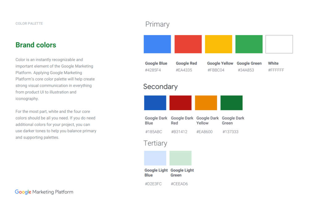
Sometimes colors are hard to understand — ‘why can’t I use the color I like’? Here, your job as a designer will be to explain to your client why having a consistent color palette is important.
Certain colors evoke certain emotions. Just like red grabs the attention, blue soothes the eye. Green has an association with nature, and yellow is happiness and joy. Depending on what the brand will want to convey, the psychological aspect of colors should be taken into consideration.
Another reason for creating a brand color palette would be the fact that the people’s eye is easily overwhelmed. By using only a few colors, you ensure your visual identity is balanced and won’t cause sensory overload to the potential customers.
Why should your clients have a brand color palette?
- The possibility to establish an emotional connection with consumers, on a subconscious level.
- The possibility to link the brand with a certain association a color conveys.
- The possibility to create an appealing visual aspect of a brand (people tend to often make decisions based on the visual element solely).
- The colors are other assets that can bring recognizability to your brand. Some colors are now forever associated with certain brands, like Coca Cola red or a Facebook blue.
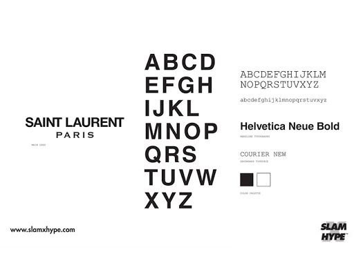
3. Brand Fonts

The same story as with colors: fonts have psychology behind them. There are different families of fonts, and each of them can be used to the brand’s advantage. That is why it’s important to add fonts to the visual brand identity.
For example, Serifs are the fonts that were used since always to print books. In people’s subconsciousness, they are tightly associated with knowledge, professionalism, and storytelling — even if they don’t realize that. Decorative fonts are artsy and quirky and are great to accentuate the individuality of a brand. Sans serifs are more modern and readable, often used on websites and long pieces of information.
Why should your clients have brand fonts?
- The possibility to establish an emotional connection with consumers, on a subconscious level.
- The possibility to link the brand with a certain association a font conveys.
- An overload of the different fonts used chaotically is considered bad manners and can scare the customer away.
- Believe it or not, fonts get stitched to their brand over time. Together with colors and a logo they can become a strong identifier of a brand.
4. Brand Typography
Roughly speaking, typography is the way the fonts are displayed, their hierarchy, sizes, boldness, etc. If designed correctly it helps your visuals to convey the needed message, in the order you need it to be conveyed.
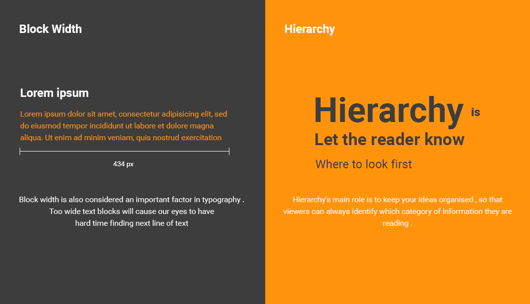
Why should your clients have brand typography?
- The font layout used in the brand’s visual identity — throughout all mediums — brings recognizability.
- Clear structure and hierarchy allows to control what information gets to the user first, and thus control their thought process.
5. Shapes and Patterns

The way you design and use the branding pattern will determine how people will perceive your brand. Shapes also have their psychology: round shapes are harmonic and can be perceived as more feminine-looking; triangles and straight lines are a denominator of strength and can be perceived as more masculine-looking.
Overall, the patterns a brand will end up using will need to be scrutinized and picked according to the impression a brand wants to set. If a brand is a lawyer’s office, you won’t probably be using floral designs or cute polka dots — they won’t be making people think of professionalism.
Why should your clients add brand shapes and patterns to their visual brand identity?
- Help to establish an emotional connection based on psychological associations.
- Allow creating recognizability, as people start to associate certain shapes with a certain brand.
- Allow setting a certain image just from a single look at what patterns you use.
6. A Consistent Style for Graphics

Patterns, illustrations, photography, shapes — whatever you use in the branding matters. All visual elements need to be structured and specifically designed for a certain business, according to its tone of voice, message, services, values, and, of course, target audience.
If a brand stays consistent in using the same visual identification, such as colors, shapes, fonts, etc, it’s a direct way to become memorable.
‘Hm, where have I seen that pattern? Oh, right, this brand’s using it on their packaging. By the way, that cup I ordered from them…’, — this is the thought process a brand should be aiming for. Make people remember the brand, and their previous experience with it just from simple color, or a shape, or even a letter.
Why should your clients have a consistent brand style?
- A consistent style creates an impression of a serious and professional brand that cares how people see it.
- Being true to the brand identity allows being recognizable and memorable.
7. Brand book
Along with working on the visual brand identity, you can work on the brand book parallelly. Creating professional brand guidelines from the get-go ensures the business always stays on track and leaves no room for going outside the image walls. With a brand book at hand, a business has a cheat sheet of what direction to pursue.
Why should your clients have a brand book?
- Brand guidelines are a great way to stay consistent with the brand’s style — no matter how small the business is.
- Consistency = memorability.
- A brand book provides a guideline for new employees or out-sourced workers.
Fortunately, now, you won’t have to spend too much time designing one for your client — Gingersauce’s smart automation will help. Inside the app, you will be able to add all the brand identity elements — including the visual ones.
You can use Gingersauce’s wizard directly to pull up a color palette from teh logo you uploaded.

Find a perfect font for a brand.

And of course, add mockups of how the visual brand identity will look in the real world.

For you, as a designer, presenting a brand identity in a brand book format, allows your client to visualize how the brand will look. It will capture the essence of the brand and will leave them with little room for nitpicking.
See the Part 1 of the article to learn the right way to offer your client to design a visual brand identity.
A Killer Argument
As we mentioned in the previous article as well, people always look for authorities. Brand owners are no different, they want to be successful, so they want to borrow some success secrets from other big brands naturally.
If the client hesitates about why they need a visual identity, show how big the brands do it. The big companies create design systems and brand books just to keep track of their visual identity and stay true to it — that is why your client should too.


See more in Gingersauce’s Gallery!
Create and Present Brand Identities Using Gingersacue!
Gingersauce is professional a tool for creating brand guidelines, that combines smart automatic features and your creativity. It’s a professional tool – meaning, it won’t do a half-baked job, leaving you with a mediocre result.
Add all the brand identity elements as you go and receive an awesome and professional brand book in the outcome. Time — saved, the client’s expectations — surpassed.