Sometimes, working on a visual of any sort – a logo, branding pattern, a website, or rather anything you can think of – the ideas just won’t come. You twist it, play with it, joggle with elements and nothing decent presents itself.
It happens to the best of us. The art block. This last year was mentally exhausting, it’s just no wonder we feel worn out. But with the year 2021 coming up, it’s time we restore some of the creativity loads. How?
Fear no more. Today we are sharing with you some of the graphic design tips you can try, and summon the muse to your workflow. All the tricks are shared by one and only Josh – Gingersauce’s Founder, and a designer with 20 years of experience.
We hope it will help you to start off the new year with good vibes and lots of inspiring design ideas. Let’s keep it rolling!
1. Twins for the win! Repetition in design.
Repetition is one of the great design principles that every designer should know. It’s rather simple, repetition means repeating a design element many times.
It can be used in different ways. To form a shape.

To create a minimalistic logo.


To create a pattern.

As a background for a highlighted element.

The examples shown above mostly focus on the forms and shapes, yet repetition in design is not only about that.
Repeat fonts. Use only 2-3 fonts within a single design. Otherwise, you’re risking that your work can look unprofessional, chaotic, and overwhelming.
Repeat colors. Choose a color scheme or the brand colors you’re working with, and stick with them. This way you can balance the weight across all of the visual consistently.
Repeat branding elements and style. If you’re doing design work for one project, the style should remain consistent in every medium. The colors, fonts, shapes, layouts should work together to help the brand become more memorable.
Repeat images and settings. Photos of the same photographer used with the same filter all the time. This will ensure your website, for instance, doesn’t look cluttered and chaotic.
If you’re struggling to stay consistent with the designs you create for different projects, try creating a brand book for each of them. With Gingersauce, you can do it in a few minutes. Just add the assets and leave all technicalities to the wizard!
Bear with us, we have some more interesting graphic design tips to share with you!
2. Bring in some harmony! Symmetry in design.
Moving on with our tips for graphic designers with symmetry.
Symmetry is basically the same visual weight on both sides of the axis. Such composition has proved to appear more aesthetic and harmonic while allowing to quickly register what’s being seen.
The symmetry trick helps the eye to focus on the picture as a whole, instead of going for a standing-out element of the composition.
Reflection Symmetry
Also called the mirror symmetry. The simplest one, as the second element is the direct reflection of the first one. The line of symmetry – the axis that lays in the middle of two symmetrical sides – can take any direction. The most common one, a vertical direction, we can see the most often not only in designs but in nature as well.


Rotational Symmetry
Rotational symmetry is when an element is rotated in a certain direction around a point.

If we talk about this type of symmetry in nature, you can observe it in flower petals, or in snowflakes, for example. In design, it’s often used to show motion and action.

Translational Symmetry
Translational symmetry is when an object is relocated to another position with its general or exact orientation.

More often than not this type of symmetry in design is used to create patterns, where you are taking an element (or a few) and repeat it.

3. Make a statement! Scaling in design.
One of our favorite graphic design tips to share is being creative with your sizes.
If you’re stuck at some point in your design, try playing with sizes. Of course, proportions are important but scaling things can do a lot for your imagination.
As an example, take the most popular style of illustrations these days. Exaggerated proportions everywhere, and what do you know – it does look very interesting. This seemingly butchered anatomy is not painful to look at, on the contrary, it catches the attention.

Illustration of course is not the only thing you can play with. Try changing the sizes of the texts, elements, buttons, anything you can think of. This will also shift the attention of the viewer, and can potentially throw in some cool ideas.

Playing with scaling, you might also see if elements fit inside one another – this is a cool trick for interesting logo designs, for example.

4. A little math won’t hurt! Geometry in design.
There are a few reasons geometric design is so popular. For one, it’s extremely pleasing to look at. It’s all because geometric shapes can be seen all over the nature surrounding us, the spirals of the flower petals, the circles of planets, the hexagons of snowflakes.
The math rules the world, everything is built according to rules, like the Golden ratio for instance.
Though people might not realize it, they are more drawn to geometric shapes.

Another reason is psychology. Different shapes have different connotations for them. Ovals and circles are harmony and eternity; sharp lines and angles are strictness and professionalism.
This said, using different shapes you can convey different emotions, set different tones, and basically play with people’s subconsciousness.
Next time you’re staring at a white empty canvas, try throwing in any geometrical shape. And work around it, see where it will take you.
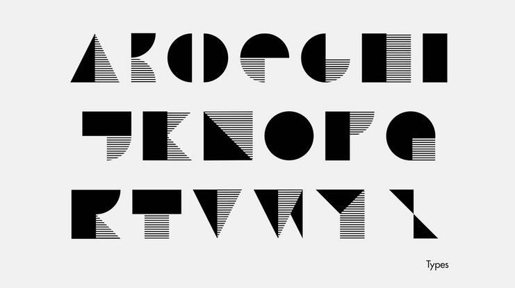
Note: Push your imagination even further, and try to use shapes as letters. We all know a triangle will read like an ‘A’, but how would you show ‘R’? This is an awesome way to see the design from another angle.

Hexagons conveniently used to form a letter ‘S’ and an Infinity sign. Credits.
Geometry holds a special place in our graphic design tips of today since we are firm believers that any graphic design visual has proportions, calculations, and a little bit of math at the base of it. Do you agree?

5. Stay in your lane! Set boundaries.
This one is something you won’t find in any graphic design tips out there.
Sometimes having limitless opportunities, and an abundance of space to roam scares instead of inspiring. This next tip is especially applicable if your client hasn’t provided you any information, believing that it will only suppress your creativity flow.
If you have no boundaries to work off of, try setting them for yourself. Choose a color scheme, a topic, a technique, a typeface, before opening the program of your choice. Whether you decide on them yourself or use online generators – doesn’t matter.

This is your way of creating a base for your work. A touchstone, if you will.
The Bottom Line
Every time you’re sitting glaring at the white canvas, come back here and see if any of the graphic design tips shared here work for you.
Do you think our recommendations will be helpful? We believe that they will help you leave the art block in 2020, and step into 2021 with new ideas only.
Stay Creative and Save Time With Gingersauce
Gingersauce is a professional tool for creating brand guidelines, that combines smart automation and your creativity. It’s a professional tool – meaning, it won’t do a half-baked job, leaving you with a mediocre result.
Use it to stay consistent with your design process: add the brand’s logo and other identity elements, let the wizard help with the customization, and receive perfect guidelines for further work. No more starting from scratch!


