Simply picking fonts you like won’t do. Fonts are the reflection of your brand’s personality, values and “feel”.
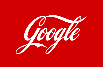
Check out the picture below. Does anything seem a bit off?

We bet you understood right away what’s wrong, did you? The text says Google but the font screams Coca Cola. This is a very illustrative example of the fact that a font is an integral part of any brand identity.
Some companies like Netflix, Airbnb, Apple and already mentioned Coca Cola have even created their own fonts and made them a part of their visual identity. A personal font for a unique brand – that’s the morals.
But, among so many options, how to choose just the right fonts and styles for your particular brand? Let’s find out. Presenting some brand typography guidelines from Gingersauce!
What is Typography?
Everybody knows what fonts are. But what about Typography? Well, those aren’t the same. Typography in design is the way your fonts are displayed, how their combination radiates the personality of your brand.
When speaking brand typography it is not only about picking the right fonts – which is an incredibly important task in its own – it’s also the matter of choosing the line lengths, the suitable kerning (space between characters), and tracking (horizontal spacing of characters).
However unimportant choosing brand fonts and thinking about typography in general may seem, in fact, it can easily help you build a strong recognition on the market. On the contrary, if you visit the website and something about the texts there look a little off – you simply won’t consider the company a professional one.
Fonts and Typefaces: what’s the difference?
When looking up information about the brand typography, it’s easy to get confused with the terms Fonts and Typefaces. Sometimes they are used interchangeably, which is not technically correct.
If we are talking about Typeface, we basically refer to the whole family of fonts, a specific design of type. For example, Times New Roman is a typeface.
If referring to a particular size, weight, and style of a typeface – it’s a font. For example, Times New Roman, 12 pt., Bold.
Reading brand typography fonts is an experience
“Branding is the subtotal of all the “experiences” your customers have with your business” , – Brian Eisenberg.
When a person sees a text on your website, or on the ad, it’s important to make that experience pleasurable. Because this particular occurrence will stick a connotation to your whole brand.
Typography in branding is very important to make sure a user has the most pleasurable impressions. You don’t want your text to be too small, or spaced poorly: this will make it less readable and will lead to a customer leaving without even knowing what you’re offering.
What seems to be a small mistake can make users hesitant if your brand is worthy of a chance.
How to pick brand fonts?
Step 1: Create a brand personality
By determining what is the soul of your brand, you can find out how to express it: through colors, fonts and subsequently any visuals you create.
Try thinking of what associations you want people to have with your brand, how would they describe you using a few adjectives.
Set a mood your brand will radiate and pick a typeface that will reflect it in the best way possible.
Read more about how to create a brand personality in the dedicated article right here.
Step 2: See to competitors
Always remember to check how your competitors present themselves. While creating a distinctive presence for your brand, you definitely don’t want to choose the typographic language that’ll be identical to your rivals.
Double check!
Step 3: Choose the brand fonts group that suits your brand message
People build associations with everything that surrounds us. Fonts and branding typography styles are no different. Each typeface evokes particular emotions, thus creating varying impressions on the viewer.
For example, sans serif fonts are usually perceived as being more modern looking, while serifs are more classical and old-fashioned. Let’s see in detail!
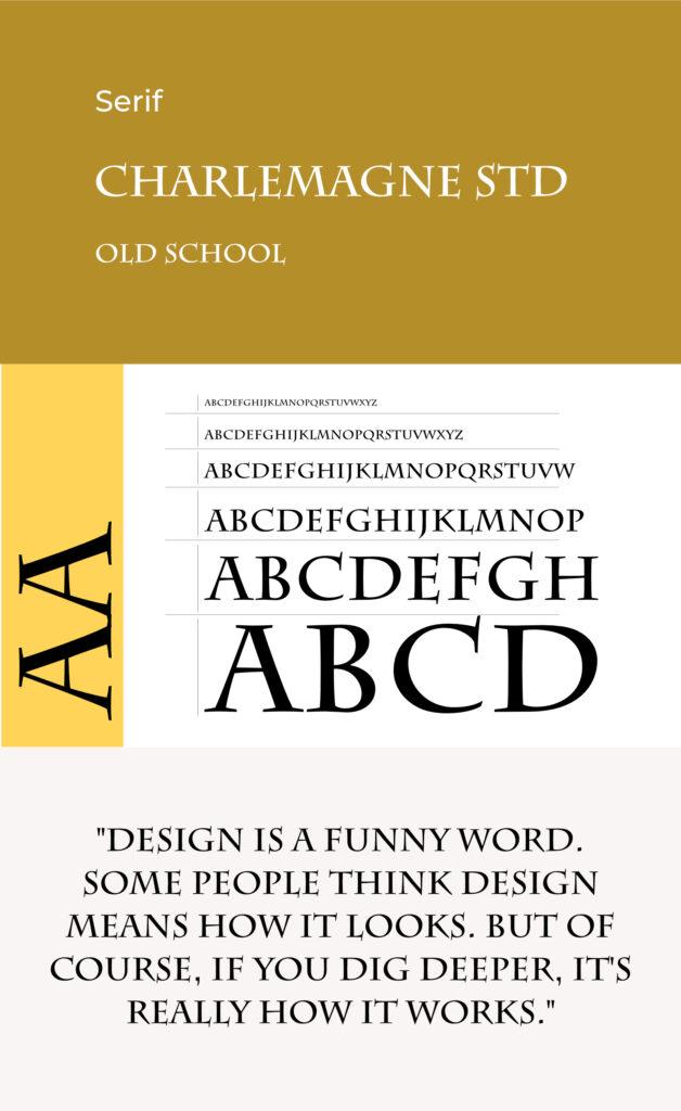
Serifs: Formal, trusting, mature, prestige.
Considered to be classic and traditional. Delicate strokes, ornamental designs. More suitable for brands that want to appear established, serious, elegant, and trustworthy.
Used in books for centuries on end, serif fonts make the impression of being educational and authoritative.

Sans-Serifs: Informal, agreeable, modern, chic
Considered to be modern and contemporary. Clean lines, precise designs. More suitable for brands that want to appear approachable, innovative, casual, and friendly.
Sans-serifs are cleaner and thus easier to read on a large scale.

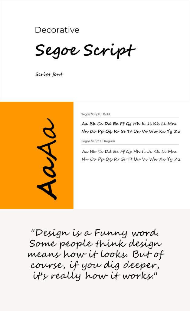
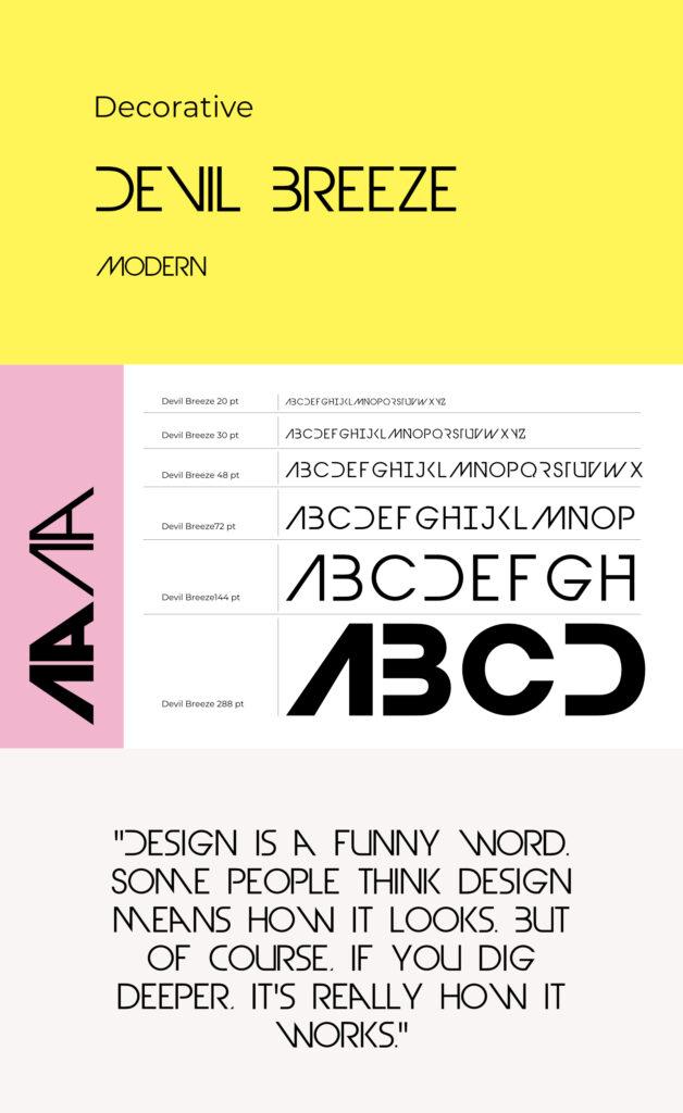
Decorative: unique, artsy, personal.
Considered to be artistic and eye-catching. Embellished and highly ornamental. More suitable for brands that want to appear artsy, imaginative, and thematic.
Vary from cute to fancy, from very thematic to looking like a handwriting.

Monospace: technological, minimalistic
Considered to be modern and minimal. All letters take up the same horizontal space. More suitable for brands that want to appear ‘under designed’, minimalistic; evoke programming, and typewriting associations.
More suitable for brands centered around innovations and technology.

Step 4: Choose the branding fonts
Having decided on the family of fonts that reflect the values of your brand, it’s now time to get to choosing the fonts themselves. Focus on picking only up to 3 types: a large variety of different styles can both complicate the design process, and overwhelm the customers.
At this point you should make sure the fonts you’re considering are easy to read both on large and small screens.

Step 5: Make sure everything goes together
As you pick the fonts, you need to create contrast, while making sure every type suits the other ones. It’s hard, we won’t lie to you, but! There are tools that will help you. Try creating mockups of various use cases and see what works best for your brand.
A few helpful tools for mix and matching:
Step 6: Make sure…
… your brand typography is flexible for every type of application. Will it look good printed, or in a blog format?
… your brand typography works together with other elements of your visual identity. Don’t choose soft, rounded letters for a jagged, rough looking logo, or web page design.
… your brand typography is scalable. Are the fonts you used available in multiple sizes and weights? Or other languages?
Step 7: Designate roles
Every typeface has to have its own role in your design system. Consider making a comprehensive hierarchy of fonts for:
- Headers
- Subheads
- Body copy
- Callouts
- Pull quotes
- Product packaging
Step 8: Choose Treatments
Picking fonts is only half the deal. You can also add a lot of personality by the treatment of the fonts you’ll choose.
These include:
- Boldness
- Italicised
- ALL CAPS
- all lowercase
- Underlined
- Tightly or loosely kerned (space between letters).
- Size, leading (space between lines of text).
- Color.
Created Your Brand Typography? Form it into Brand Guidelines!
Gingersauce is a professional tool for creating brand guidelines, that combines smart automation and your creativity. It’s a professional tool – meaning, it won’t do a half-baked job, leaving you with a mediocre result.
A key goal of brand guidelines is keeping a record of all your branding elements, including the visuals like brand typography: Gingersauce will gather everything in one place and will help you make sure your brand design stays consistent and cohesive.
You can download a created brand book right away – it will look promising even with no customization!


