When you present your logo work to clients, your goal is convincing them in your creative vision and stylistic choices. There’s a problem, though – clients aren’t designers. Things that you take for granted might not be that obvious to a client. Creative decisions that would be immediately appreciated by fellow-designers or art-directors often don’t stand out to business owners.

Clients might not understand the difference between fonts and gradients. But we all understand and love a good story. The inspiration behind the concept, the workflow, mission, and vision that lie at the core of the work – all these things should be spelled out in your presentation.
What’s the gain? Professional design presentation makes a difference in the way clients perceive you. If you don’t limit yourself to just a brand logo but prepare a full brand identity instead, you will be able to charge more. You will be able to enter the pro league.
What is the logo presentation?
It’s a document that features your logos, alternatives, variations, mission, vision. You can include additional branding elements like color palettes, fonts, and icons.
A good logo presentation is the one that
- Shows the full concept behind the logo rather than just slapping images in the client’s face;
- Describes the inspiration behind the design, letting the client in the creative process
- Collects all the alternatives and variations and presents them to clients;
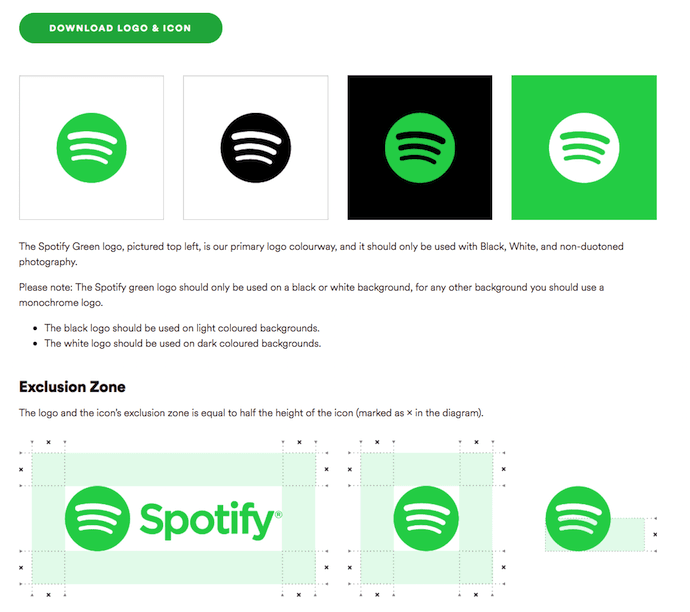
- Provides answers to practical questions like “How will the logo look on the dark background? or “Does it fit for printed ads?”
- Makes file navigation comfortable both for you and your client.
Many designers don’t invest that much time in presenting their logos. They prefer traditional methods like sending files over emails. Generally, it’s not a good idea – and here’s why.
- Designers are expected to put in efforts in visuals and presentation. We are getting paid to make things look good, and it’s natural that clients come with certain expectations. We have to provide each step of the way that we are careful with artistic details and concepts.
- Files in email attachment give off the draft vibe. Clients think that you are sending logos not for approval but for discussion. You are laying the ground for multiple edits and feedback loops.
- When you will be building your portfolio, you’ll have to invest more time in presenting logos anyway. Why not save yourself some time and present your work properly right away? You’ll save a lot of time in the long run.
- You can charge a lot more for brand identity compared to ordinary logo prices. When you present logos with variations, use cases, palettes, you are increasing the price tag on your design.
- Designers who send files in attachments will struggle to present themselves as pros. To distinguish yourself from beginners, you have to use practices that beginners either don’t know about or ignore. Set the bar higher than the rest of the market – that’s how you will move to the premium category.
So, by presenting your logos in the detailed presentation, you avoid unnecessary questions and edits. You can charge 2-3 times more and provide the full brand identity, based on the logo work.

At this point, you might have a question. Sure, the gain is obvious, but how much more effort will it require to prepare an impressive presentation?
If you were to do it manually in the Illustrator, it could take up to several days. But you don’t have to take this road. With Gingersauce, you can create a full brand book for your logos in just 5 minutes.
How to present your logos with Gingersauce?
Gingersauce is an online platform that allows designers to build a branding identity from just a logo. It’s a professional tool built for designers who want to present their work in the full presentation.
We took all the best manual practices that are used by professional graphic and branding designers and automated them in the smart editor. After reading this guide, you’ll know how to create a presentation with logo variation, fonts, palettes, mission, vision. The fun part is, the style of the brand book itself is automatically designed to suit your logo’s style and colors, yet everything is still customizable for your creativity to shine.
Here’s what we are talking about. This is an example of Skype’s brand book that we built with Gingersauce.

See the neat little detail? The word “logo” is underlined by a blue line, exactly in Skype’s logo color. There are dozens of such small details dispersed throughout the brand book. These small accents give your brand book the custom look and feel – even if in reality, it was built in less than 5 minutes!
Getting started
Start by entering your brand name and slogan. Upload a logo. Select the type of brand book that you’d like to build. Are you branding a product or a company? Is it a new brand or rebranding? The editor selects templates depending on your purpose.
Step 1 – Upload the main logo
Select an SVG logo to get started with building a brand book. Gingersauce editor will use this vector image as the main reference for creating a palette, fonts, use cases, proportions, etc.
Why SVG?
Gingersauce uses SVG files because they can be easily modified by the editor. This format is not damaged during edits, providing professional logo variations and use cases. After testing multiple formats and getting feedback from users, we understood that SVG logos fit the needs of logo presentation the most.
What to do if I don’t have an SVG logo?
Just open your file in Adobe Illustrator and resave it as SVG. It takes less than a minute. If you don’t have Illustrator or experience some difficulties with the process, don’t worry. You can write in our messenger Chat (in the lower right corner of the page), and we’ll convert it for you right away.

Add alternative logos
A good logo presentation should feature more than one logo, but it’s not a mandatory requirement. To get a perfect presentation, we encourage you to add a secondary logo.
Gingersauce allows you to add 2 more logo images to represent your brand in its full colors and complete style.
The editor will edit both your primary and secondary logos, prepare variations, calculate proportions, and prepare custom palettes.
Approve a palette
When you create a color palette for the logo, you are going beyond simply creating logos. You start talking about brand identity – and that’s exactly what most clients are really looking for. Also, using a color palette in the presentation gives the client a better view of your creative process.
Gingersauce pulls up the color palette used in your primary and secondary logos. You can edit each color manually – the editor has a smart design for selecting a precise color shade.
- Each color is described by its code: you can easily use these specific colors in all promotional materials, design projects, product design, etc.
- You can manually choose the preferred shade and the editor will find a matching 6-character code.

Approve logo variations
We are nearing the most important part of the brand presentation. Seeing one variation of the logo allows clients to understand a basic concept. To understand how the logo can be used practically, designers have to apply it to different backgrounds and styles.
The old-fashioned strategy is to create all these variations manually, spending 5-10 minutes on each icon. If you have many logos and icons, you’ll need days to wrap things up.
However, our smart automation offers you a much smarter alternative. Gingersauce will offer you 3-6 alternatives for your logo use. These options include black and white positive, negative, primary color positive and negative, and others. The exact types and number of variations depending on the logo itself. You can also upload all the logo variations that you have created manually. Automation is a feature, but it’s only optional.
Add a brand icon to your logo presentation
Logos often tend to be pretty big. You need to fit in the name of the brand or incorporate several visual elements. Obviously, a large-format logo doesn’t fit to all advertising formats, websites favicons, and other mediums. This is why you absolutely need to include an icon into your logo presentation.
With Gingersauce, you can upload the favicon for your brand in the vector file. Remember though that you should create the icon beforehand – so far, Gingersauce doesn’t have features that would let you create an icon right on spot.
However, if you already have an image, Gingersauce will help you do the rest of the magic for you. The editor will offer its variation, use and misuse cases, and insert it between the pages. This step adds a touch of personality to the brand book.
Approve a brand icon variation
Just like a primary logo, a brand icon is set to undergo variations, which are executed after the user’s approval. Consider multiple design options, black and white negative and positive, primary color variations, etc.
At this point, your logo presentation already has multiple layers and variety. What before would’ve been a simple email is now forming into a full-fledged brand book. And we aren’t even done yet.
Describe logo proportions
A logo will be used to represent the brand everywhere. This is why your clients will appreciate having precise information on the logo’s characteristics and use cases. Most people you’ll work with might not even ask for these details – but since you are an expert, it’s up to you to know better. That’s what pushing the bar is all about.
Why do you need to describe proportions scientifically?
Industry standards are pretty specific when it comes to defining proportions, shapes, and dimensions. There are geometric rules and laws that most designers are taught to follow. Many of the images that you interact with are governed by precise geometrical laws and composition rules.
Professional designers are those who know how to combine creativity and science. Gingersauce makes it a lot easier – just choose a law and proportion, and the editor will automatically adjust the image.
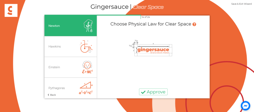
Now you’ll be able to casually mention to clients that you used the Fibonacci compositional scheme and adhered to Pythagoras space laws.
- Choose logo proportions among common compositional schemes like Leonardo, Michaelangelo, Fibonacci, Vitruvius, etc.
- Determining a clear space: choose physical laws for the space around the logo among Newton, Hawkings, Einstein, Pythagoras, and other mathematical and physical principles.
- Determine dimensions for minimal size calculation: you can choose the minimum allowed size of the logo that will still preserve the general look and readability. Gingersauce Editor offers four options, from the smallest to the largest: quarks, neutrons, atoms, molecules.
Once again, you don’t have to know in-depth details about these proportions. Gingersauce will provide you explanation and information, and most importantly, you’ll see the effects of each of these laws in action, on your logo. After some trial and error, you’ll quickly figure out what options work best for this particular project.
Approve logo misuses
Every professional logo presentation sets clear restrictions on how a logo shouldn’t be used. This way, designers help teams to figure out the best ways of applying logos to materials. The presentation should be a guideline to logo use – this is how you can help your client to avoid mistakes later on.
What’s in it for you? Including logo misuses into your presentation shows that you care about your logo’s destiny once it’s out there. This speaks volumes about your professional quality – thinking long-term and seeing the bigger picture are qualities of thorough, experienced, and enthusiastic designers.
Gingersauce Editor automatically processes the main logo and determines laws that shouldn’t be violated in the process of logo modification. The examples of logo misuse options in Gingersauce are:
- Do not distort or alter the proportions of the logo.
- Do not add contours to the logo.
- Do not add a drop shadow to the logo.
- Do not change any elements respectively to each other.
- Do not rotate the logo to any angle.

You don’t have to agree with every logo misuse law, proposed by Gingersauce. It’s possible to reject some of the offered options.
Select primary and secondary fonts
If you want to dive even deeper into offering full-fledged brand identity, consider adding fonts to your presentation. It won’t take long – Gingersauce allows you to upload custom fonts as well as choosing among existing ones.
In the editor, you can define the main font and pick additional variations. Make sure that these fonts are unified by a single concept and fit cohesively with the style of the logo.

Adding a font to your logo presentation takes a couple of minutes, possibly seconds. The impact, however, is much bigger. Your client will see that you are willing to go overboard and include additional elements into the project. Once again, you will be taking your logo work to the next level – without making any changes to the logo itself
Another fun part: add mission, vision, values
At this point, the visual preparation of your presentation is almost done. All that’s left is describing your inspiration and the concept behind the visual.
Gingersauce presentations feature pages, dedicated to the brand’s mission, vision, values. Such structure of a brand book gives designers a chance to elaborate on their creative thought. You can describe the bigger picture behind your logo.
Professional designers who prepare logos and brand identity for large brands excel in this. They research key values and elaborate on them in the final work. Even if your logo is a simple black square, you might have a shot of selling it – if there’s a compelling story behind.
Examples of brand missions that you can use to describe your concept
- Slack: the speech bubble evokes communication and connectivity, and will form the basis of a system of customized icons, illustrations, and motifs with rounded corners that echo the shapes of the logo.
- Starbucks: the logo is derived from a twin-tailed siren in an old sixteenth-century Norse woodcut.
- Skype: the brand name is inserted in the Cloud that represents the communication bubble, an integral element of Skype’s interface. The blue color in the Skype logo expresses main brand values – communication, prosperity, and the emotion of hope; White color represents harmony and peace.
As you can see, professional designers and big brands care a lot about the story behind their logos. Your clients do, too. In fact, the story might be just as important as the visual itself.
In Gingersauce, you can simply type or paste your mission in the editor – the tool will add it to the presentation and present it in the style of the brand.
It’s time to present your logos
For years, designers had to create logo presentations manually, which took loads of time. With such an inefficient method, it’s no wonder so many choose to simply send logos via attachments.
Hopefully, our work here at Gingersauce will make it easier for you to present your logos. You don’t need to install any software or edit every variation manually. All the process is online and takes less than 5 minutes. The result, however, is highly professional and custom. Try it out yourself – and offer a lot more value to your clients.