There are many ways to make your design stand out. One of our favorite ones is a negative logo. It’s amazing how much effective use of the negative space influences the look and feel of a design. If done right, visuals get that artistic, luxury feeling, which is what so many brands are looking for now.
We like to take inspiration from art, and negative logos are a good example. In this guide, we’ll talk about how to design a negative space logo by playing around with letters and show 26 references, for each letter.
Stick around if your question is “How to make a negative space logo”. Let’s go!
What is negative space logo?
Whenever you are working on the design, you have three elements in the game – positive space, negative space, and the frame. Frames delimit borders of the visual, positive space is a section with an object, and negative space is everything that surrounds it.
Here’s what we mean


It’s easy to think of a negative logo as a simple background for the image. Most designers do that and end up designing the main image without paying attention to its surroundings.
How to use negative space in a logo?
However, there’s another strategy, which lies in the clever use of negative space. Here’s what we are talking about.
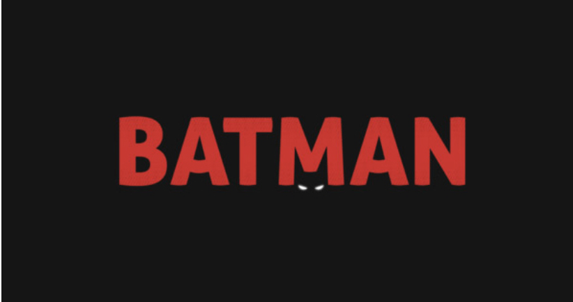
Take a look at the BATMAN logo. Obviously, the word itself is the main space. However, designers found another hidden opportunity. A letter M hits a mask – the word literally starts with it, and shape brings associations, too.
So, they placed two eyes just below the letter, hinting an iconic BATMAN’s mask.
Negative space letters are one way of creative an awesome logo.
How to design a negative space logo?
Designing a negative logo is challenging at first, both technically and creatively. However, the practical execution is usually simple. The example above is easy to execute, once you have a ready vision.
So, the key priority in design a negative space logo is finding a creative concept.
Out of the blue, it’s quite a confusing goal. Luckily, there are techniques that can help you get out of the box and consider creative usage of negative space.
Work with letters and images
It’s not an accident that most negative logos feature letters. Not all of them, of course, but it’s a trend. Designing negative logos by interpreting letters in the world and finding interesting combinations works incredibly well.
This is because most people already have some associations with a particular character. All you need to do is drop an additional clue and let the viewer’s imagination figure out the rest.
So, how to design negative space logos? Well, the easiest way to achieve this is by combining letters and figures in one image. Both are graphically simple characters and convey clear associations. The most common elements, combined with letters are:
- Arrows with letters like I, H, T;
- Circle with O (designers often experiment with this letter due to its similarities with a facial shape);
- Triangles with V and W (V can be seen as a tick, mountain pick, a flying bird, etc – in other words, simple objects of a trigonal shape).
Below, we prepared examples and brief guidance for negative logos for each of the 26 alphabet letters. They present clever ways of seeing negative space and guessing the image behind the letter.
How To Design Negative Space Logo: Ideas for 26 letters
You can form a geometric shape with one letter or with a combination of them. Of course, these geometrical elements should be consistent with the logo’s intent and purpose. A brand that is focused on producing environmentally healthy projects, can use O to represent a spheric form of Earth.
Logistical brands can play with arrows – they mean movement, development growth. A real estate agent might choose to represent a house roof with an A letter.
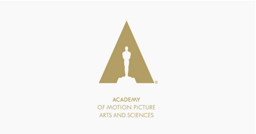
Letter A
A for Academy is formed due to the efficient use of negative space. It’s a great example of how to use negative space for logo design. Combine well-known images, letters, and optical illusions to get the viewer’s imagination going.
Letter B
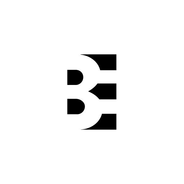
A letter B is formed entirely by negative space between elements that comprise E.
Letter C
It is formed by negative space between the cup and the frame of the letter. It’s an optical illusion that conveys the focus of the brand on three concepts – coffee, to come, cup.

Letter D
For a letter D, designers played around with dots. The brand is called Dots, and the logo represents a dog, taken out of the letter – forming a D as a result. It’s a creative combination of a concept and suitable use of negative space.
From this, we can derive a valuable insight on how to use negative space in logo design: try “taking out” shapes from the letter and turning them into standalone composition elements.
Letter E
This letter is easily one of the most loved by graphic designers in terms of building a negative logo. In this example, it represents an arrow, but also – a titled house. A great idea for a real estate company.
Letter F
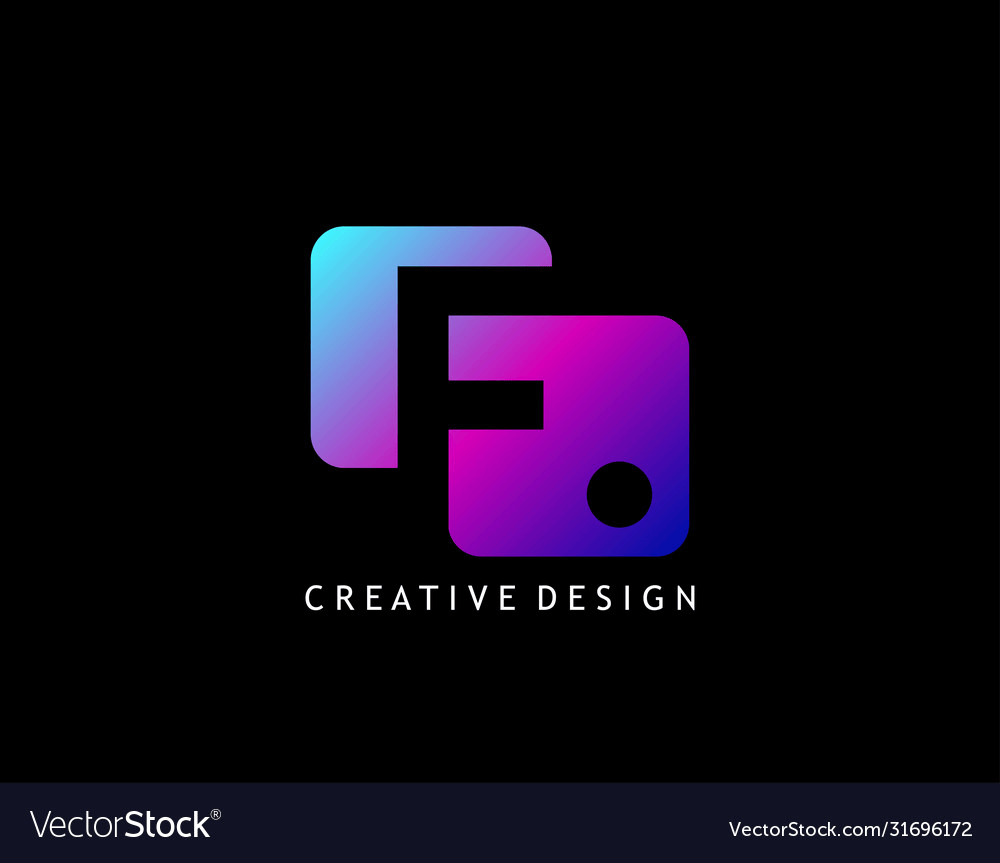
Chances are, you won’t immediately notice an F letter on this one. However, if you look again, you’ll see a black F and a dot formed entirely by negative space around geometrical figures. Indeed, the logo is a great fit for a creative agency.
Letter G

Letters with round shapes like G, U, and O are often used metaphorically. Another idea on how to use negative space in logo design is by forming illusions of faces and alive things. Designers represent emojis, animals, living things by adding eyes, mouths, and other elements.
Here, designers used negative space to create an illusion of a face. By accentuating this concept with two black dots, which stand for eyes, they make the concept instantly clear.
Letter H

A common approach in a negative space design is to avoid writing the letter directly. This example shows well how to design negative logo space. If possible, try composing it out of standalone elements that represent your business model and competitive advantages.
This logo is a great example of this approach. You can see the silhouette of the H letter in the negative space between two icons. The concept of the brand is also clear – Handy is literally represented with two hands.
Letter I

The letter is formed by a combination of elements. Sure, it’s not such an obvious use of negative space, since I is technically present. However, the effective composition of elements, including negative space, allows using branding a logo without losing the readability of the letter.
Letter J
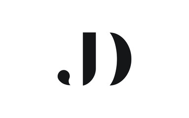
Letter J can be combined well with other letters, substituting some of their elements. Here’s an example of how a letter D was combined with J. The line looks like a component of D, but in reality, it’s a standalone letter. The effective use of negative space allowed designers to use fewer lines, and get a minimalistic effect.
Letter K
In this logo, the letter K is formed with a combination of three triangles. The letter itself can be seen due to the creative use of negative space. It’s not written anywhere, but the human eye is wired to guess shapes everywhere – and so we do.
Letter L

A heart created in a 3D cubic style and tilted. The only reason why we are able to guess the letter L here is a great use of negative space. With the use of a classical symbol of love (heart) and the letter L, the first one of the word, a designer does an amazing job of representing the concept of love.
Letter M

Another creative idea of how to use negative space in logo design – by combining geometrical figures, the shape of a heart, and alphabet letters. This time, a designer placed 8 triangles together to look like a heart, but also, like an M letter. Neither are shown explicitly, it’s a creative optical illusion due to the efficient use of negative space.
Letter N

Geometrical shapes can be used to represent the letters, but here’s an opposite strategy, too. The negative space between the letter elements can be used to represent a concept that’s relevant for the brand.
What does this tell us about how to design negative space logos? You can start by removing the color of the letter in several spots. Here, designers add just enough clues for a viewer to see a house. Technically, it’s not on the picture – but that’s a shape that our brains are prone to seeing.
Letter O
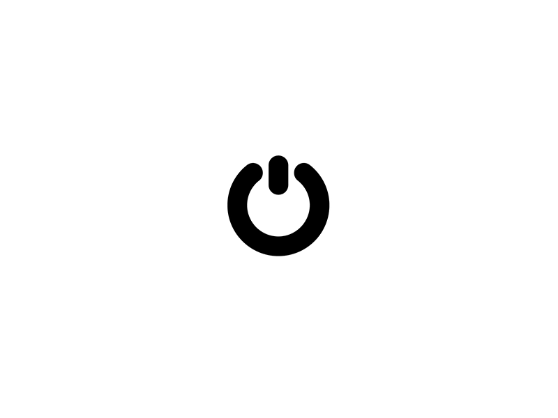
Letter O is a perfect representation of a button. Companies that deal with a computer, hardware, software development can use this to their advantage and represent optical illusions. The designer depicted an “On” computer button, but it’s easy for a viewer to guess the shape of the letter because of the negative space.
Letter P

You can easily combine a P with various shapes. It’s a good one – there’s a lot of space for designers to work with. This is why it’s used to represent all kinds of stuff – a speech bubble, emoji, animal – you name it.
Letter R
Similarly to P, an R letter has a lot of space to work with and a lot of negative space around it, too. More importantly, it calls for many great associations. Rockets, rainbows, rabbits – you name it.
So, if you are pondering on how to design negative space logo, another fun thing to do is to start with associations (typically, words that start with the letter). Whatever the work is, R has enough components to give designers space for creative experiments. On this logo, a designer depicted a rocket only by using negative space.
Letter S
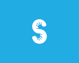
Here, designers used negative space to depict hands within the shape of the letter. Just a letter S would never make such a strong impression. Like this, however, a logo definitely sticks with you.
Letter T

Another letter that’s much loved by designers for negative space logos. It’s minimalistic, geometrical, and fits many concepts. Towers, traveling, time, transport – all these things can be represented with T.
In this example, the negative space between the lines is used to show an airplane. This would be a great logo for a tourism brand. A plane and T represent trips, traveling, tourists – all relevant images.
Letter U
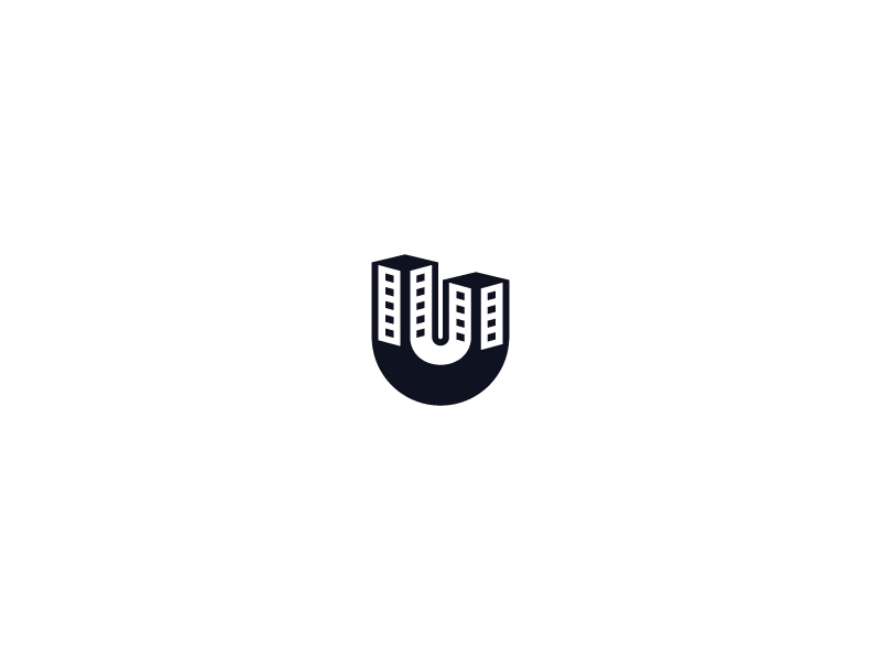
This is a great example of the usage of both positive and negative space. The combinations of the colors give a minimalistic vibe and allow guessing multiple images from a single logo. Such a concept can be applied to many industries and businesses because there are many ways in which you could interpret the idea behind it.
Letter V
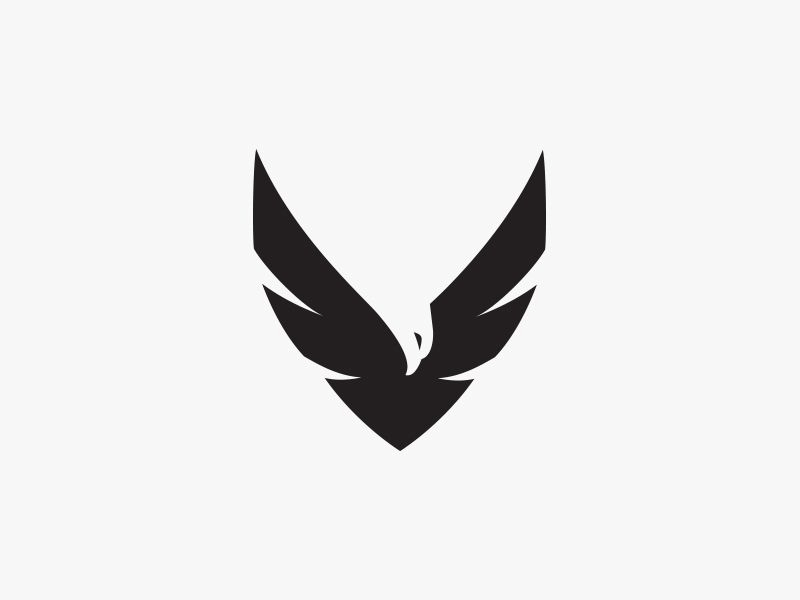
This letter is also loved by negative space designers for its simplicity. There a lot of things open for interpretation, if a designer knows how to highlight a needed image. You can combine it with messages like victory, velvet, value, vintage, etc. It’s a good idea of how to how to use negative space in design – use positive images.
The logo in the example gives off the victorious vibes. An eagle with wide-open wings gives a positive image and inspires.
Letter W

Similarly to V, W has a lot of angles and can be easily represented with triangles and pyramids, cones. This is why it’s often used as a representation of diamonds and luxury.
In this logo, you see variations of diamonds, represented with negative space and W letter.
Letter X
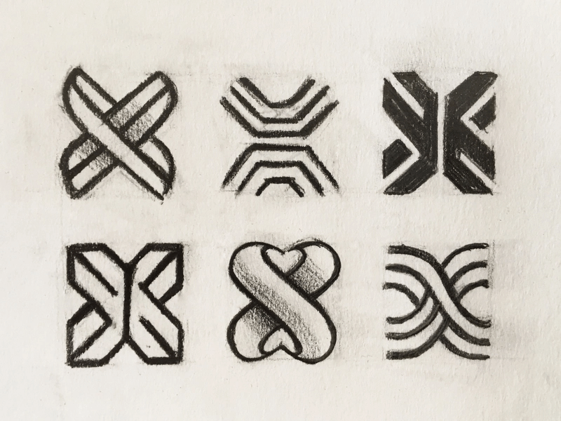
A common representation of a letter X features arrows and sharp elements. That’s not an only interpretation. thou. In this example, designers chose softer lines. So, the creative use of negative space to help viewers guess the silhouette of X. In our opinion, it worked really well.
Letter Y

This letter is often represented with spheric and rectangular shapes. This is a minimalistic example of using rectangular elements and a triangle to depict the shape of Y. The letter is not obvious at first, but if you’ll take a second look, it’s easy to guess the shape. This is really a classical approach on how to use negative space in design, which is relying on illusion, rather than being immediately obvious.
Letter Z
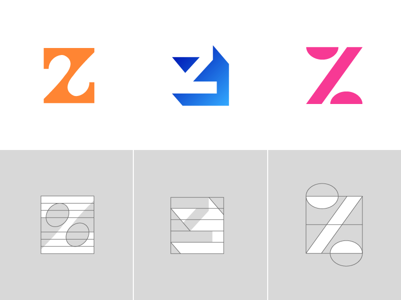
An example of a negative space letter Z, that’s formed by rectangles, circles and negative space.
Recapping the main principles
These examples, hopefully, gave you insights on how to design a negative space logo – so let’s recap the main ideas.
- To design a negative logo, you need to have a creative vision.
- Start by looking up letters from your brand name (the way we did for every letter just now) and look for associations that fit your perspective.
Possibly, seeing the work of other creators will inspire you to come up with your own unique concepts. As you can see, there are dozens of creative interpretations for each letter.
How to use negative space in design once you are done?
Once you are ready with the logo, remember to define the use and misuse cases. Negative logos are peculiar – they need specific background and proportions. A minor modification can ruin the illusion.
So, before sending your logo to the client or start using it for branding, write guidelines. You can do it in Gingersauce, a smart tool for creating brand books. We won’t do anything for you, but we will help make the process easier, faster, and more efficient.